We ♥ Graphs (September 2011 Edition).
October 3, 2011
Into the home stretch!
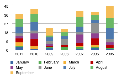
Here’s the September graph that compares year to date completed sales activity for all transactions on Lake Vermilion (including homes, cabins, and lots) since 2005.
2005 outperformed all other years to take the overall lead. 2011 kept pace with the other years but it did not pass 2010 as I had predicted last month.
I will, however, keep the expectation that 2011 will overtake 2010. If that happens, the chart will start to appear as a classic “U” shape which may indicate a continued upward trend in Lake Vermilion sales activity.
O, the drama! Stay tuned.
(Also, I admit I built this chart chronologically backwards. Oops. Too late to change now. See a reversed chart here.)
Please let me know if you have any questions about this information. Your comments are welcome, too.
 Bill Tibbetts
Associate Broker


