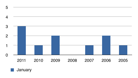
We ♥ Graphs (January 2011 Edition).
February 7, 2011
Normally, I would wait until the end of the year to compare the current year sales activity to activity in previous years.
Why wait until then?
At the end of each 2011 month I’ll update this graph to show how YTD sales compare month to month. That might allow a more proactive viewpoint of where our market is trending.
These numbers will reflect actual completed sales transactions on Lake Vermilion. Other sales will not be included but the Lake Vermilion activity should be a good reflection of our total area real estate market.
 Bill Tibbetts
Associate Broker


