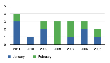
We ♥ Graphs (February 2011 Edition).
March 1, 2011
Here’s the monthly graph that compares year to date market activity to previous year activity. Again, this information shows Lake Vermilion sales only. I figure that’s a fair indicator for our overall market.
The next several months could be interesting.
 Bill Tibbetts
Associate Broker


obviously the year is on the bottom – but what does the 0 – 5 mean on the left side?
3 homes were sold in January 2011, then just 1 in February?
Comment by Nancy — March 4, 2011 @ 12:41 pm
You are correct, young one.
Comment by Bill — March 4, 2011 @ 2:45 pm