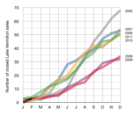
Comparative Lake Vermilion Sales YTD Through February.
March 13, 2012
It’s another year.
We should, again, keep tabs on the market. We should compare the current activity to the activity from previous years. Here is the graph that will allow us to see if 2012 will continue the recent trend of marginally improving market activity.
As before, the numbers show closed real estate sales on Lake Vermilion only. Lake Vermilion is, by far, the most active segment of our local market and it is a good indicator of the broader market trend.
Year to date sales for 2012 are represented by the short black line on the bottom left of the graph.
I’ll update the graph on a monthly basis.
 Bill Tibbetts
Associate Broker


