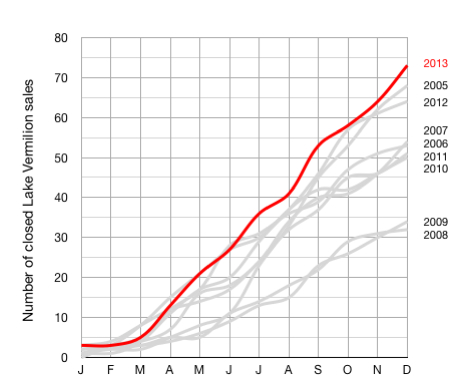
Comparative Lake Vermilion Sales (2005-2013).
January 3, 2014
Here is the final end-of-year chart that illustrates comparative Lake Vermilion real estate market performance for the years 2005 through 2013.
(The grey lines show previous years and the red line represents 2013 completed sales.)
As shown, the improving market trend remains intact with the number of completed sales steadily increasing since 2008. Optimism is high for 2014. Watch this website for all the market details as we progress into the new year.
Please let me know if you have any questions related to these details. I am also happy to provide additional information on the Lake Vermilion real estate market.
(All data was sourced from the Range Multiple Listing Service.)
 Bill Tibbetts
Associate Broker


