We ♥ Graphs (March 2011 Edition).
April 1, 2011
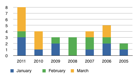
Here’s the March graph that compares year to date completed sales activity for all transactions on Lake Vermilion (including homes, cabins, and lots).
The number of sales will start to increase as we enter April. As we progress through the year It will be interesting to how 2011 compares to 2005-2010. That period gave us the best and the worst real estate markets within a relatively short time span.
Please let me know if you have any questions about this information. Your comments are welcome, too. (Data and graph updated on April 4, 2011.)
 Bill Tibbetts
Associate Broker


