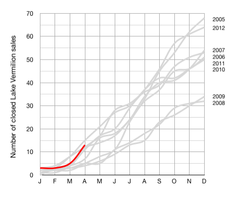
Comparative Lake Vermilion YTD Sales (Though The First 4 Months of 2013).
May 25, 2013
For the statistically minded, here is the chart that illustrates comparative Lake Vermilion real estate market performance for the first four months of 2013 versus previous years.
(The grey lines show previous years and the red line represents 2013 year to date completed sales.)
Please let me know if you have any questions related to these details. I am also happy to provide additional information on the Lake Vermilion real estate market.
 Bill Tibbetts
Associate Broker


