 Bill Tibbetts
Associate Broker
Bill Tibbetts
Associate Broker 
2009 Postscript.
January 14, 2010
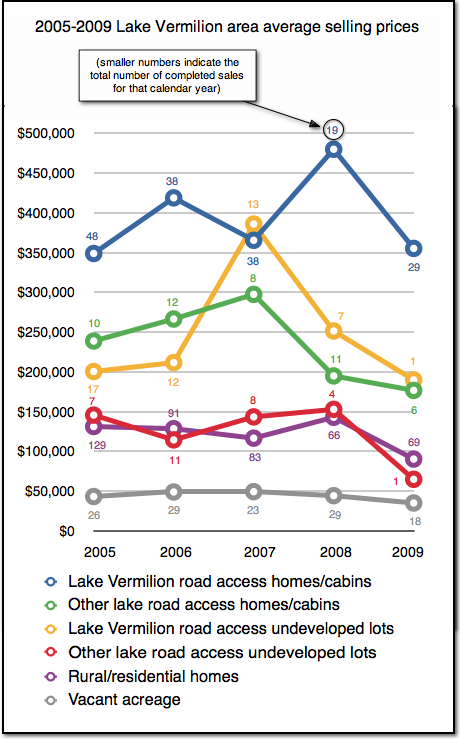
Here is one final graphic to help illustrate how the 2009 sales year compared to the previous 4 years. The graph illustrates the average selling prices for 6 separate property types in the Lake Vermilion area real estate market.
The key word related to this graph is “average”. Please bear in mind that the individual selling prices covered a very wide range.
The graphic also notes the total number of completed sales for each year for each property type.
Please let me know If you have in interest in the specific numbers related to this information.